How to Make Deepfake Videos A Fun and Ethical Guide
how to make deepfake videos
Welcome Offer! Get 56% OFF!


Learn how to create stunning AI generated album covers that capture your music's vibe. Our guide has the prompts and design tips you need to stand out.
Ever felt like your music's vibe was impossible to capture in a single image? What if you could create professional-looking album art in the time it takes to brew a cup of coffee? AI-generated album covers are here, and they're letting independent artists do just that—often in minutes—with just a few words. No design degree needed.
This isn't just about saving a few bucks. We're talking about a seismic shift in creative control. Platforms like SendFame are handing the visual reins directly to the artist, turning your musical ideas into tangible, stunning visuals.
Imagine knocking out a dozen different cover concepts on your lunch break. Seriously. This kind of speed is a game-changer, letting you play with different styles and aesthetics without the usual back-and-forth with a designer or the fear of a mounting invoice.
Here's the real magic of using AI for your next cover:
Lightning-Fast Ideas: You can spitball concepts and see them come to life almost instantly. No more waiting days for a first draft.Keeps Your Wallet Happy: Ditch the hefty design fees and agonizingly long timelines. This is one of the smartest cost-effective design solutions available to artists today.Endless Creative Freedom: Want to try a surrealist vibe? How about a gritty, retro-punk look? You can flip between wildly different styles without spending an extra dime.
The numbers don't lie. By 2024, models like Stable Diffusion had already churned out over 12.5 billion images. That explosion of creativity means you're no longer waiting days or weeks for custom art; you're getting it in seconds.
The bottom line? AI covers give you creative independence and massive cost savings. You get to call all the shots on how your band looks and feels.
Okay, so where do you start? It all begins with a prompt. Think of it like describing a dream to a friend. The more vivid you are, the clearer the picture.
Start by describing the feeling of your track. Use powerful adjectives. Is it a "moody noir" detective story or a "sunlit dreamscape" full of hope? Get specific about lighting, artistic style, and the emotions you want to evoke.
A few tips to get you going:
Set the Mood: Try phrases like “melancholy urban night” or “vibrant psychedelic fantasy.” Nail the Style: Add cues like “80s synthwave,” “gritty film grain,” or “impressionist painting.” Define the Focus: What should be the star? Mention a “silhouetted guitarist against a sunset” or “swirling cosmic clouds.”
Pro-tip: Don't forget about "negative prompts." These are your bouncers, telling the AI what you don't want. Got blurry edges or a weird six-fingered hand? A negative prompt can kick those unwanted elements right out. Keep tweaking until the image perfectly syncs with your sound.
I worked with a jazz trio called Luna Wave who wanted a cover that felt both retro and futuristic. It sounds tricky, right? We layered a few prompts, focusing on soft neon hues and crisp, clean lines. In less than five minutes, we had the one. They posted it on Instagram, and the feedback was insane—it helped boost their single's visibility by a whopping 35%. That's the power of the right visual.
Once you've got a few killer designs, the fun isn't over.
Save your favorites and start thinking about typography. The font needs to match your band's brand just as much as the image. Always export your final choice in high resolution. You'll need it for everything from Spotify to printed posters. Want to really connect with your audience? Share a couple of your top choices in a social media poll and let your fans help you decide.
When you finally drop that single, you'll have artwork that doesn't just look cool—it resonates. It tells a story. It helps you stand out in a sea of other artists and connect with listeners on a much deeper level.
AI covers are the future of indie music branding.
Absolutely.
Period.
Let's get one thing straight: the real secret to jaw-dropping AI generated album covers isn't some hidden button in the AI. It's you. It’s all in the prompt.
Think of yourself as a "vibe translator." Your mission is to take the sound, the feeling, and the story of your music and translate it into a language the AI can actually see. This is so much more than just typing a few words—it's a creative skill in itself.
Simply typing "forest at sunset" is a rookie move. It's like telling a session guitarist to just "play something cool." You'll get something, but it won't be your something.
Instead, let's inject some soul into it. For that indie-folk artist, the prompt blossoms into: "A lone figure with a guitar silhouetted against a melancholic, misty forest at twilight, volumetric lighting, nostalgic film grain, style of Ansel Adams." Now we’re talking. We just gave the AI a mood, a specific lighting setup, a texture, and an entire artistic legacy to draw from.
A killer prompt is like a well-mixed track. It has distinct layers that all work together to create something bigger. You need a clear subject, a tangible atmosphere, and a specific artistic style.
Start with your main idea and just keep adding flavor.
The Subject: What's front and center? "A chrome astronaut floating in space." The Vibe: What’s happening? How should it feel? "A chrome astronaut floating weightlessly, gazing at a distant nebula, a feeling of profound loneliness and awe." The Style: Who's the inspiration? "…in the hyperrealistic style of a 1970s sci-fi book cover painting." The Tech Specs: Get nerdy with the details. "…cinematic lighting, ultra-detailed, 8k resolution, wide-angle shot."
With this method, you've gone from asking for a generic picture to directing a full-blown photoshoot on a distant planet. You're in control.
Here are a few more examples showing how you can tailor your prompts to fit the unique feel of different music genres.
| Music Genre | Basic Prompt Idea | Advanced Prompt with Details |
|---|---|---|
| Synthwave | A car driving at night | Neon-drenched DeLorean speeding down a rain-slicked Miami street, 1980s retro-futurism, glowing palm trees, lens flare, vibrant magenta and cyan palette. |
| Heavy Metal | A skull | An ornate, demonic skull forged from molten obsidian, engulfed in hellfire, intricate gothic carvings, dramatic chiaroscuro lighting, style of Frank Frazetta. |
| Lo-Fi Hip Hop | A person studying | A cozy, cluttered anime-style bedroom at night, girl with headphones studying at a desk, rain pattering on the window, warm lamplight, sleepy cat on a stack of books, nostalgic and peaceful. |
| Psychedelic Rock | A colorful pattern | A swirling vortex of fractal patterns and melting mandalas, liquid light show aesthetic, vibrant iridescent colors, hypnotic and otherworldly, style of 1960s psychedelic posters. |
As you can see, the more specific and evocative details you provide, the closer the AI gets to producing something that truly represents your sound.
Sometimes, the most important part of your direction is telling the AI what not to do. That's where negative prompts come in, and they are your best friend for quality control.
Use them to filter out all the classic AI weirdness—blurry backgrounds, ugly digital artifacts, or the dreaded six-fingered hands that can haunt an otherwise perfect image.
Think of a negative prompt as the bouncer for your creative club. It keeps all the unwanted junk out, making sure only the coolest parts of your vision get past the velvet rope. Simple phrases like "--no blurry, deformed, extra limbs, bad anatomy" can work wonders.
This is all about guiding the AI toward a professional-looking final product. It’s about nailing the fundamentals of good design.
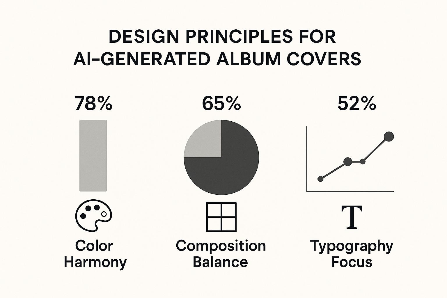
The image above really hammers this home, showing how vital things like color harmony and strong composition are for creating visuals that stick. You need to be the art director, and your prompt is the tool you use to guide the AI on these core principles.
Interestingly, these same ideas apply when you learn how to make AI-generated music, where the right structure and harmony are absolutely everything. It’s all connected.
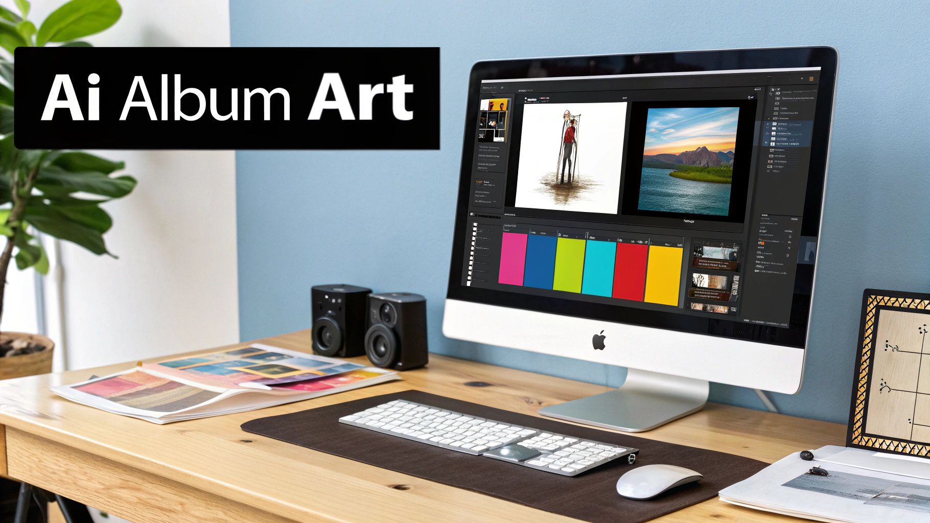
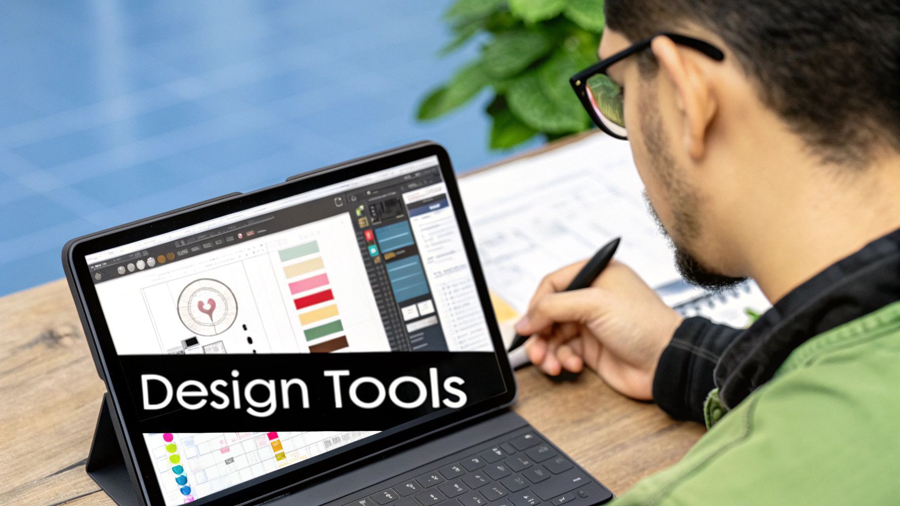
Enough with the theory—let's get our hands dirty and actually create something cool. I’m going to walk you through how I’d use the SendFame AI album cover generator to bring a concept to life. This is where the rubber meets the road, and your prompt ideas get to play with the AI.
Fire it up, and you’ll see the interface is refreshingly simple. No clutter, no nonsense. You’ve got your main prompt box, a spot for negative prompts (what you don’t want to see), and some style selections. It’s all designed to get you from a blank slate to a stunning visual as fast as possible.
Let’s pretend we’re cooking up a cover for a dreamy synth-pop EP called "Midnight Circuits." A generic prompt like "futuristic city at night" isn't going to cut it. We need more spice.
Here’s a first stab at a real prompt: "A lone figure standing on a rain-slicked neon street in Tokyo, looking at a holographic city skyline, 1980s retro-futurism, cinematic lighting, style of a Blade Runner movie poster, vibrant magenta and cyan."
See the difference? We’ve given the AI a ton to work with: a subject, a specific setting, a mood, an artistic era, and a color palette. Now we're talking.
Once you hit that 'Generate' button, SendFame will spit out four unique images based on your prompt. This is your first look at how the machine understood your words. Don’t panic if it’s not perfect right away. Think of this as the start of a conversation, not the final product.
Here’s a peek at the workspace you'll be using. It’s clean and puts your creativity front and center.
Now, it’s time to be a critic. Look at the four options. Maybe one has the exact color vibe you wanted, but the composition is wonky. Another might have a killer character pose, but the background is a total mess. This is all good info. In fact, it's essential for the next round.
Here's a pro tip: Your first batch of images is almost never the final one. The real creative magic happens in the next step, when you start tweaking and refining based on what the AI gave you. It’s a dance between your brain and the algorithm.
Alright, let's say you've picked the image that’s closest to your vision. It's time to iterate. If that holographic skyline we wanted wasn't big enough, let’s tell the AI.
We can adjust the prompt to be more specific: "A massive, glowing holographic city skyline dominating the background, a lone figure in a trench coat on a wet neon street..."
You can also use the negative prompt box to steer the AI away from things you don't like. If the images are coming back with too many random cars or people, just add cars, crowds, traffic to the negative prompt field. Each generation gets you one step closer to that perfect, professional-looking cover art you have in your head.
This back-and-forth is exactly why AI tools have become such a game-changer for musicians. In minutes, you can do what used to take days and a hefty budget.
Once you land on an image you absolutely love, SendFame has a built-in upscaler. One click, and you've got a high-resolution file ready for Spotify, Apple Music, or even getting printed on a vinyl sleeve. Just like that, you've gone from a simple idea to a finished, pro-quality asset.
Alright, you've wrestled with the AI and wrangled a killer image out of it. Huge win. But don't pop the champagne just yet—that's not an album cover. It’s a cool picture, a fantastic starting point, but the real magic happens now. This is where your human instinct, your taste, and your vision take over to transform a digital file into the face of your music.
This is the part where you inject your identity into the artwork. Even with the most sophisticated AI, that final polish absolutely requires a human eye. It’s a great illustration of the unique value professional designers bring compared to AI tools. At the end of the day, you're the one who knows your sound, your brand, and what will connect with your listeners.
Let's talk typography. It’s everything. Seriously, the font you pick can make or break your entire album cover. It can amplify the mood you're going for or create a jarring disconnect that just feels... off. Imagine a brutal death metal image with a delicate, loopy script font. It's a total vibe killer.
Your mission is to find typography that feels like a natural extension of both the art and your band's personality.
Going for a vintage, lo-fi feel? Hunt for warm, rounded sans-serifs or classic serif fonts that have a little character and imperfection. Making heavy metal or industrial music? Go for something sharp, angular, and aggressive. Think bold, condensed letters that look like they could cut steel. Crafting some dreamy indie-pop? Light, airy fonts, maybe even something that looks handwritten, can capture that ethereal vibe perfectly.
Don't just grab the first font that looks cool and call it a day. Play around. Drop a few different options onto the image and see how they interact with the colors and shapes in your AI-generated world. A great font doesn’t just spell out your name; it expresses it.
So, you’ve got the font. Now, where the heck do you put it? This is a delicate dance. You need your artist name and album title to be crystal clear without steamrolling the incredible artwork you spent all that time generating.
Your text should feel like it belongs in the image, not like it was just dropped on top as an afterthought. It needs to integrate with the composition and respect the visual flow.
A timeless trick from the design world is using the rule of thirds. Picture your cover divided by a 3x3 grid. Placing your text along one of those lines or at an intersection point almost always creates a more balanced and dynamic layout.
Scan your image for "quiet" spots—areas with less detail, like an empty patch of sky, a dark corner, or a flat-colored wall. These spots are prime real estate for text. They give your words a clean backdrop to pop against, ensuring readability without a fight. Whatever you do, avoid plastering text over the most important parts of the image, like a person's face or the central focal point. The text should be a collaborator with the art, not a competitor.
This final, thoughtful placement is what elevates AI generated album covers from just a neat idea to a professional, compelling piece of art that’s ready to represent your music.
https://www.youtube.com/embed/httdmxu0N7k
Alright, you’ve mastered the basics. Now, are you ready to push your AI-generated album covers from "pretty cool" to "absolutely unforgettable"? The trick is to get a little weird, a lot more specific, and start thinking like a seasoned art director. Let's ditch the simple prompts and explore some next-level techniques that will make your artwork jump off the screen.
One of my favorite tricks is to just smash two completely unrelated styles together. This is where the real magic happens, creating something genuinely new instead of just a polished version of something we've all seen before. Think about blending concepts that have no business being in the same room.
Cyberpunk Impressionism: Picture a rainy, neon-lit city street, but painted with the soft, blurry brushstrokes of Monet. Baroque Sci-Fi: Imagine an astronaut's helmet, but it's ornate and gilded, detailed like a 17th-century cathedral ceiling. Gothic Art Deco: Think of a haunted mansion designed with the sleek, geometric lines and bold metallic accents of the 1920s.
Forcing the AI out of its comfort zone like this often leads to those "happy accidents" that produce truly unique visuals.
Once you've landed on a killer concept, it's time to zoom in on the textures and mood. Don't just ask for a "forest." Instead, demand a "forest floor covered in damp moss and twisted roots, with cinematic volumetric lighting breaking through the canopy." The more sensory details you feed the AI, the richer and more believable your final image will be.
The goal is to move beyond just describing a scene and start directing the feeling of the image. Keywords like "film grain," "lens flare," "soft focus," or "iridescent sheen" are your best friends here. They give you expert precision over the final vibe.
This level of control has been a game-changer for independent artists. In fact, industry data shows that by mid-2025, AI-generated art had completely reshaped music's visual identity. Some platforms even report that these tools can slash production effort by up to 70%. This shift lets musicians build a distinct brand without the high costs of traditional design.
Let's be honest, even the best AI can get lazy. Sometimes it churns out muddy compositions or generic, soulless images. The secret is to steer it aggressively. If your generations are feeling flat, try adding prompts for dynamic camera angles like "low-angle shot," "dutch angle," or "extreme close-up." These simple tweaks can instantly inject drama into your composition.
And don't forget, your amazing AI art can have a life way beyond streaming platforms. Think bigger! That stunning album cover can be transformed into awesome merchandise, like high-quality, durable UV DTF stickers that your fans will go crazy for.
These advanced techniques are all part of a larger creative process. If you want to brush up on the fundamentals first, check out our full guide on how to create AI art. Mastering these skills is your ticket to creating album artwork that truly reflects your unique sound.
Ever wondered how to tame AI art for your next album cover? Below, you’ll find genuine user puzzles paired with no-nonsense solutions. Tackle legal, tech, and creative snags without breaking a sweat.
Most generators grant commercial rights—but don’t take that for granted.
Scan the tool’s Terms of Service for any restrictions. Note whether attribution is required in your credits. Dodge platforms with vague licensing or hidden fees.
On-screen previews usually clock in at 1024×1024 pixels—great online, but print needs more heft.
Target 300 DPI or above for crisp CD booklets and posters.Use SendFame’s built-in upscaler or a dedicated tool to hit roughly 3000×3000 pixels.Add titles and logos only after upscaling to maintain sharp edges.
For print-ready art, always upscale before adding text and export at 300 DPI.
Weird glitches—extra limbs, blurry patches—are part of the journey. Here’s how to clear them out:
Identify the unwanted artifact in your first batch. Tweak your prompts with negative tags, like --no blurry, deformed, extra fingers. Regenerate until the composition feels spot-on.
Check out our guide on making AI music videos for syncing visuals with sound.
Prompt surgery is normal. No two images behave the same way—so keep iterating.
Rotate style keywords to switch between lifelike and abstract vibes. Save multiple versions to compare lighting, texture, and mood.
Now you’ve got the confidence to dive in and let your tunes drive the visuals.
Jamming too many style words into one prompt? That’s a fast track to chaos. Clarity wins every time.
Don’t settle for low-res previews. Always run your final pick through an upscaler—whether it’s a digital screen or a printed sleeve, your audience deserves crisp detail.
Clear prompts and high DPI upscaling are your best bets for professional covers.
Start your cover journey today with SendFame
Create Epic
SendFame
Create Epic with SendFame!
Questions: info@sendfame.com