8 Unforgettable Funny Voicemail Idea Scripts for 2026

funny voicemail idea
Welcome Offer! Get 56% OFF!


Learn how to create font from image with this guide. Turn your handwriting or designs into professional TTF/OTF fonts using AI tools and expert tips.
Absolutely! You can create a font from an image. The whole process boils down to taking your design—whether it’s your handwriting, a killer logo, or some cool sketched characters—and turning it into a scalable vector format that you can then package up as a font file. It’s all about cleaning up the image, tracing it with the right software, and tweaking the spacing. It's an incredible way to bring a truly unique visual identity to life.
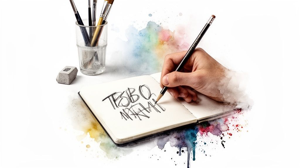
Have you ever doodled a logo, looked at your own handwriting, or stumbled upon a vintage design and thought, "This would make an awesome font"? Well, you’re onto something. This guide is here to show you exactly how to create a font from an image, turning that flash of inspiration into a real digital tool you can use anywhere.
And no, you don't need to be a seasoned typographer to pull this off.
We'll dive into the tools that make this magic happen, from one-click AI font generators that do the heavy lifting for you to the more hands-on vector editors that give you total control. Think of this as your personal launchpad for injecting some serious personality into your brand, spicing up your social media, or just making your creative projects one-of-a-kind.
Look, a custom font is so much more than just a way to type out words. It sets a mood, creates a vibe, and builds an identity that people remember. When you step away from the same old generic typefaces everyone else is using, you start building a visual brand that’s stronger and more connected. For any business trying to carve out its own space, this is huge.
The real magic happens when your audience recognizes your brand from the typography alone, even before they read the words. This level of brand recall is the ultimate goal of custom font creation.
The possibilities are pretty much endless. Picture a wedding invitation designed in the couple's actual handwriting. Or a local coffee shop whose logo font started as a quick sketch on a napkin. Maybe a YouTuber whose video titles pop off the screen with a typeface that’s 100% them. These are the kinds of personal touches that take a project from "nice" to "unforgettable."
And if you're into creating other unique visuals from scratch, you should definitely see how you can create AI images from text.
So, how do you actually turn that image into a font? There are a few different paths you can take, each with its own pros and cons. This table gives you a quick rundown to help you figure out which approach is the best fit for you.
| Method | Best For | Required Skill Level | Typical Time Investment |
|---|---|---|---|
| AI Font Generators | Quickly converting clean handwriting or simple logos with minimal fuss. | Beginner | 5-30 minutes |
| Automated Tracing | Digitizing moderately complex images in vector software like Illustrator. | Beginner to Intermediate | 1-2 hours |
| Manual Tracing | Gaining complete control over complex or imperfect source images for a polished, professional result. | Intermediate to Advanced | Several hours to days |
Choosing the right method really just depends on your source image and how much time you want to spend perfecting the final result.
I’m going to break this whole thing down into easy-to-follow steps. We'll cover everything you need to know, from prepping your image to installing your finished font.
Image Preparation: How to get your source image looking clean and ready for its digital transformation. Vectorization Methods: A head-to-head look at automated AI tracing versus meticulous manual techniques. Refinement and Spacing: The nitty-gritty of kerning and metrics to make your font actually readable and beautiful. Export and Use: The final step—generating that font file and unleashing it on the world.
Your custom font is more than just a file; it’s a powerful asset. As you get started, you'll see just how impactful Branding With Fonts can be.
Alright, let's get into it.
Before you even think about turning those pixels into a font, we need to talk about your source image. Think of it like a chef prepping ingredients—the final dish is only as good as the stuff you start with. Getting this initial part right is honestly the most important thing you can do to avoid a world of pain later.
Your main goal here is brutally simple: maximum contrast. We're talking crisp, bold, black characters sitting on a perfectly clean, pure white background. Any smudges, weird shadows, or grayish tones will just confuse the software, leaving you with bumpy, inaccurate shapes that look nothing like your original design.
This is where a little digital elbow grease makes all the difference. Fire up your favorite photo editor and start playing with the levels or curves. Your mission is to crush the blacks and blow out the whites until you have a stark, two-tone image. This isn't just an aesthetic choice; it's the bedrock of an accurate trace.
Seriously, the quality of your scan or photo is a massive deal. A low-resolution image is like trying to trace a blurry photo—you’ll lose all the beautiful, subtle details of your handwriting or logo. You should be aiming for a resolution of at least 300 DPI (dots per inch), but if you can swing 600 DPI, even better.
Next, it's time to put on your detective hat. Zoom way in and hunt down any stray pixels, dust specks, or shaky little lines that don't belong. These tiny imperfections might seem harmless, but they become huge headaches during an automated trace, creating extra anchor points and wobbly curves you’ll have to painstakingly fix by hand.
A clean image is a happy image. Spending ten minutes now meticulously erasing digital noise will save you hours of frustrating vector point editing later. If you're creating the characters from scratch, brushing up on your digital drawing can make a world of difference. For a great starting point, check out an easy guide to effortless digital art on iPad.
This whole cleanup process is a modern take on something called preprocessing, a technique from the world of Optical Character Recognition (OCR). This field blew up in the 1970s, and by the 90s, the tech was hitting 99% accuracy on standard fonts. The secret sauce? You guessed it: cleaning up the source images first. Old-school techniques like normalization and scaling could boost recognition by 20-30% on messy scans. You can dive deeper into this fascinating history on Wikipedia.
Here’s a perfect example of this in action. The image below shows what’s called "binarization"—a fancy word for turning a messy, grayscale image into a clean, black-and-white one.
See how the algorithm transforms that degraded historical text? It goes from a noisy, grayed-out mess to something sharp and ready for a computer to understand.
The bottom line is this: Software, whether it’s a simple tracer or a sophisticated AI, needs clear instructions. A high-contrast, high-resolution, and squeaky-clean image is the clearest instruction you can possibly give it.
Before you jump to the next step, give your image one last look. It should contain only the characters you want to convert. If you're stuck with a low-res original, an AI image upscaler and enhancer can sometimes work miracles, sharpening up the details just enough to get the job done.
This is where the real magic happens. Your pristine, high-contrast image is ready for its metamorphosis, shedding its pixelated skin to become a set of crisp, infinitely scalable vector shapes. This transformation is the very heart of the process, and you’ve got two great ways to tackle it: the quick-and-dirty automated trace or the a-bit-more-fiddly-but-oh-so-worth-it manual vectorization.
For those who just want to get it done, automated tools are a lifesaver. Modern software, especially the AI-powered stuff, can chew through your image and spit out vector paths in the blink of an eye. This is perfect for clean handwriting or simple logos where the lines are already pretty solid. The machine does the grunt work, giving you a fantastic starting point in almost no time.
But if you’re a perfectionist (and I know you are), manual tracing gives you total, uncompromising control. This is a hands-on method, usually done in a program like Adobe Illustrator or its free cousin, Inkscape. You'll be using tools like the Pen Tool to painstakingly click and drag every curve and corner into existence, ensuring the final vector captures every last bit of character from your original sketch.
When you're up against a deadline, automated tracing is your best friend. Most vector graphics programs have a feature baked right in, often called "Image Trace" or "Live Trace." With a few clicks, the software looks at the dark and light parts of your image and draws vector shapes around the black bits.
Keep an eye out for these settings to get the best results:
Presets: Start with something like "Black and White" or "Sketched Art." They’re already geared up for the kind of high-contrast image you've prepared. Threshold: This slider is your main control. It tells the software what it should consider "black" and what it should ignore as "white." Tweak it until the preview looks just right. Paths & Corners: These settings dictate how complex the final vector will be. High fidelity will hug your original lines tightly but might create a million little anchor points, making it look a bit jittery. Lower fidelity will smooth things out beautifully.
The whole reason this automated step works so well is because of the prep work you did earlier.
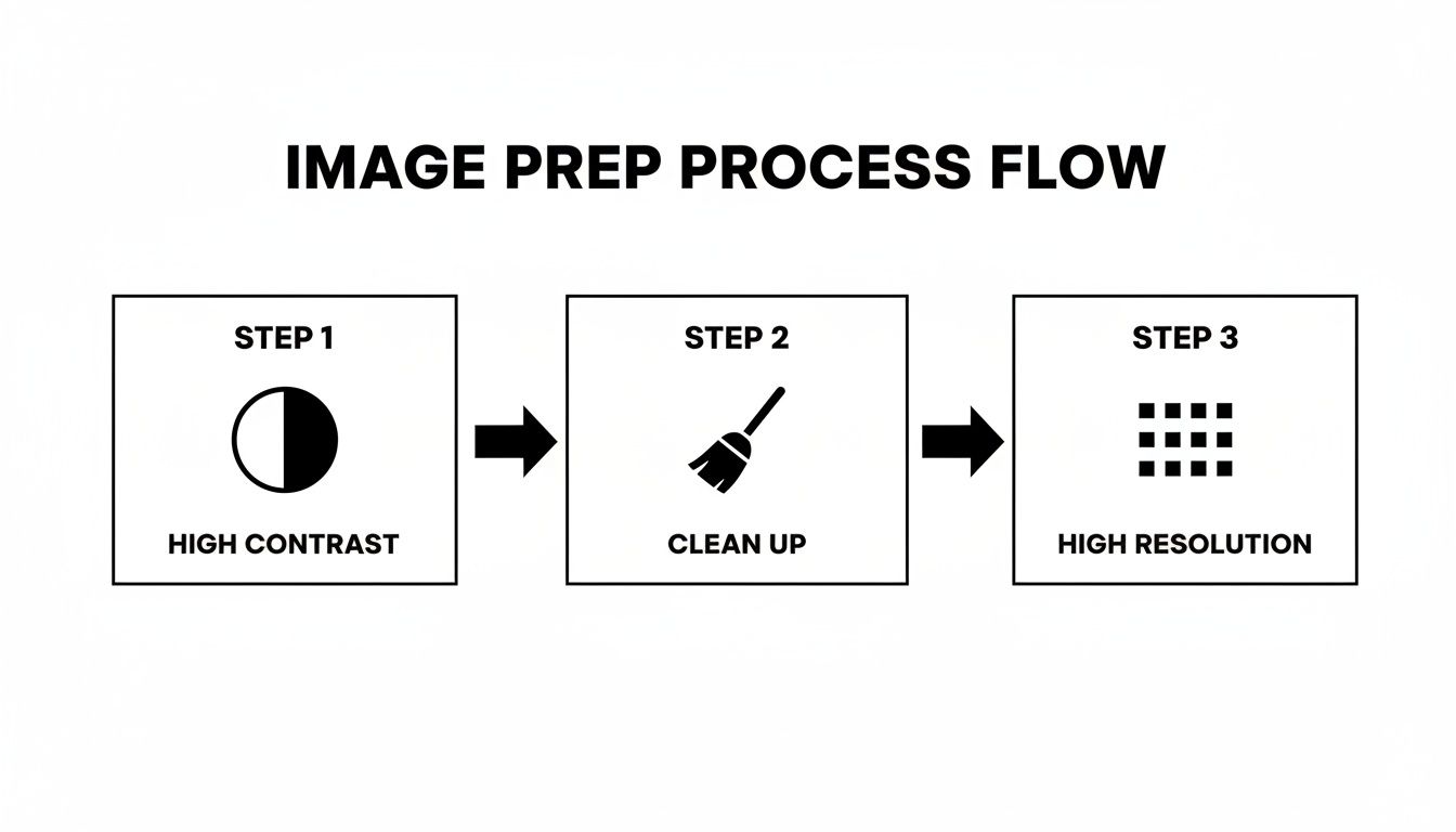
Seriously, this simple flow—high contrast, a good clean-up, and high resolution—is the secret sauce for getting a clean vector from any automated tool.
If letting a robot do the work feels a bit like cheating, then manual vectorization is where you get to show off your artistic flair. Using the Pen Tool, you’ll place anchor points at strategic spots on your character and connect them with paths. It sounds tedious, but you have absolute authority over every single line.
The real trick to a gorgeous manual trace? Use as few anchor points as humanly possible. No, really. Only place them at the very peak of a curve or at a sharp corner. This forces you to create long, elegant, smooth lines instead of the wobbly, bumpy mess you get from too many points. It takes some practice, but the ridiculously clean results speak for themselves. And if you're interested in other ways to create cool visuals, you can always explore how to craft stunning images with an AI image generator and editor.
Pro Tip: Don't try to trace an entire letter in one go. That's a recipe for frustration. Break it down into its basic components. A lowercase 'a,' for example, is just a circle and a stem. Trace them as two separate, overlapping shapes and then merge them. The result is so much cleaner, you'll thank me later.
Honestly, for most of my projects, I land somewhere in the middle. I'll start with a quick automated trace to get the basic shapes on the board. This saves me the mind-numbing task of outlining everything from scratch.
Then, with the rough vectors in place, I switch over to my manual tools and start refining. Instead of drawing paths from thin air, I'm just cleaning up what the machine gave me. I'll delete a bunch of unnecessary anchor points, tweak the curve handles to smooth out any awkward bumps, and sharpen corners the AI might have rounded off. This combo gives you the speed of automation with the precision of a human hand—the best of both worlds.
So, you’ve wrangled your image into a collection of crisp vector letters. That’s a huge win, so take a second to celebrate! But here’s a little secret: a folder full of individual character files isn’t a font. Not yet. It’s more like a digital alphabet soup.
Now the real fun begins. This is where we separate a weekend project from a professional-grade typeface that people will actually want to use. We’re about to dive into the nitty-gritty of font editing, using powerful tools like the open-source hero FontForge or the designer’s favorite, Glyphs. Your mission, should you choose to accept it, is to breathe life into these static shapes and turn them into a cohesive, rhythmic system. It’s all about sweating the small stuff.
Before you even think about spacing, you need to put each character under a microscope. In the world of typography, we call these individual characters glyphs. It’s time to zoom way in and hunt for any gremlins left over from the vectorization process.
See any stray anchor points creating tiny bumps on what should be a smooth curve? Are your stroke weights looking a little wobbly between letters like 'o', 'c', and 'e'? This is your moment to play digital sculptor.
A few things to obsess over:
Consistent Heights: Make sure your letters are all playing on the same team. The top of your lowercase 'x' sets the x-height, and it’s your guide. Letters with ascenders ('b', 'd', 'h') and descenders ('g', 'p', 'y') need to hit consistent imaginary lines at the top and bottom. Vector Cleanup: Be ruthless. Delete any points that aren’t pulling their weight. A truly beautiful, smooth curve often needs just two anchor points with their handles adjusted just so. Visual Balance: Step back and look at your font as a family. Does the 'w' look way too bulky next to a slender 'i'? Make those subtle tweaks to create a sense of harmony.
This isn't just busywork—it's foundational. In a 2016 study, researchers hit an impressive 89% accuracy in identifying fonts from old, degraded documents just by analyzing their core geometric features. That level of precision starts with clean character shapes. If you're a nerd for this stuff like I am, you can check out the full paper on advancements in font identification on arXiv.
Okay, your glyphs are looking sharp. Now it's time to build the invisible architecture that holds them all together: font metrics. This is the science of spacing, and trust me, it’s non-negotiable.
Think of font metrics as the personal space bubble for each letter. If the bubbles are too big, words feel disconnected. Too small, and everything crashes into an unreadable mess. The goal is that perfect, comfortable distance.
The three big ideas you’ll be wrestling with are kerning, tracking, and leading. While leading (the space between lines of text) is usually handled in design software, kerning and tracking are baked right into your font file.
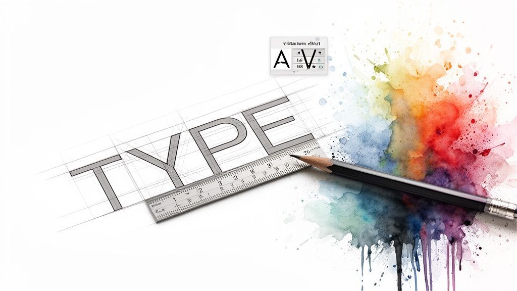
Kerning is the fine art of adjusting the space between specific pairs of letters to fix weird visual gaps. You’ve seen it a million times: the default space between an 'A' and a 'V' creates an awkward wedge of emptiness. A good kerning pair tucks them closer together, making the spacing feel right.
Don't panic—you don't have to kern every combination under the sun. Hit the biggest troublemakers first:
Diagonal letters next to straight ones (like Av, Ta) Letters that create big open spaces (like To, Ly) Punctuation next to letters (like "A, or T.)
Just setting up a few dozen of these key kerning pairs can dramatically improve the rhythm of your font. It’s this painstaking attention to detail that transforms a simple digital asset into a true design workhorse.
Alright, this is the final stretch. You've wrestled with vectors, nudged kerning pairs, and stared at glyphs until your eyes crossed. Now it's time for the big payoff: bundling all that hard work into a real font file you can actually use.
Think of this as the moment your creation leaves the workshop and hits the streets. Your font editor does most of the heavy lifting, but you have one important decision to make first.
You’ll be presented with two main choices for your font format: OTF (OpenType Font) and TTF (TrueType Font). To the average user, they look and act the same, but under the hood, they're built differently.
TTF (TrueType): This is the OG font format, born from a collaboration between Apple and Microsoft way back when. It’s incredibly reliable and works on just about everything. If you need a font that will play nice with older software or systems, TTF is a bulletproof choice. OTF (OpenType): This is the newer, more sophisticated kid on the block, courtesy of Adobe and Microsoft. It handles complex shapes with more grace and is the format of choice for designers who want to pack in fancy extras like ligatures (where "f" and "i" merge into one character) or different stylistic versions of a letter.
So, what's the verdict?
For almost everyone, OTF is the way to go. It's the modern standard and gives you more flexibility if you ever want to add more advanced features. But if you’re worried about compatibility above all else, TTF will never let you down.
Once you've made your call, exporting is usually a simple click away. Look for an option like "Generate Font" or "Export" in your editor's file menu, name your masterpiece, choose your format, and you're golden.
Congratulations! You’re now holding a shiny new .otf or .ttf file. Getting it installed is the easy part.
On Windows:
Find the font file you just saved. Right-click it. Choose either Install (just for you) or Install for all users. Done.
On macOS:
Locate your font file. Double-click it, and Font Book will pop open. Just click the Install Font button. It's that simple.
Now for the real fun. With your font installed, you can start using it everywhere. Imagine dropping your own handwritten font onto social media graphics for a look that's impossible to imitate. Or maybe you'll use that custom logo font to create a truly unique website header that perfectly captures your brand's vibe. You could even use it to add a personal, signature touch to your video titles.
This is why you went through all this effort. You haven't just picked a font from a dropdown menu; you've created a design asset that is 100% yours, carrying your brand's DNA in every single letter.
Diving into font creation is a blast, but it's really easy to get tripped up by a few classic blunders. Think of this as your cheat sheet for sidestepping those frustrating "why doesn't this look right?" moments and adding a layer of polish that makes your font feel genuinely professional.
One of the biggest rookie mistakes is all over the place letter heights and widths. You get so focused on making a beautiful 'g' that you forget it needs to live harmoniously with 'h' and 'b'. The result? A font that feels jumpy and uneven when typed, like a line of text that just can't stand still.
Another common pitfall is the wobbly curve. This usually happens after a messy automated trace, leaving you with vector paths that have way too many anchor points. These extra points create tiny, almost imperceptible bumps that ruin the smoothness of a character, making it look jittery instead of elegant.
To combat inconsistency, don't just start with 'A' and work your way to 'Z'. That's a recipe for chaos. Instead, start by designing your anchor characters—these are the letters that will set the rhythm for the entire alphabet. I always start with the lowercase 'o' and 'n'.
The 'o' sets the standard: Its width, stroke thickness, and counter (the negative space inside) become the blueprint for other rounded letters like 'c', 'e', and 'd'. The 'n' defines the rhythm: Its vertical stems, shoulder curve, and spacing establish the feel for letters like 'h', 'm', 'r', and 'u'.
Once you nail these two, you're not just designing letters in a vacuum; you're building a cohesive system. Every new character you create can be compared back to your 'o' and 'n' to ensure it fits right into the family.
Before you even think about tracing, the quality of your source image dictates everything. Messy, low-contrast scans lead to inaccurate vectors that will have you pulling your hair out during cleanup. This is where a little prep work saves hours of pain.
Modern image enhancement has gotten ridiculously good. A fascinating 2023 study showcased a new technique that boosted clarity metrics to 96.51% FM and 86.17% PSNR. For anyone looking to create a font from an image, this level of preprocessing is a total game-changer, pushing font extraction accuracy to an impressive 97.13% on some benchmarks. You can get into the nitty-gritty of these powerful image enhancement findings if you're curious.
Getting the letters right is only half the battle. Here are a few extra tricks I've picked up to elevate a font from "good enough" to genuinely great.
Test With Real Words Never, ever judge a font by just looking at the alphabet lined up. Start typing out actual words and sentences. Pangrams—those weird sentences that use every letter of the alphabet, like "The quick brown fox jumps over the lazy dog"—are your absolute best friends here. They immediately reveal awkward letter combinations and spacing issues you'd otherwise miss completely.
The ultimate test for any font is readability in a real-world context. If it looks great as an alphabet but falls apart in a paragraph, it's not finished yet. Keep testing and tweaking until the words flow naturally.
Don't Forget Punctuation and Numbers It’s so easy to get wrapped up in the alphabet that you completely forget about periods, commas, and quotation marks. Take the time to design these essential characters using the same visual language as your letters. For example, the dot on a period or comma should share a similar visual weight to the ends of your letter strokes.
And if you're thinking about other ways to generate unique visuals, check out our guide on how to create AI-generated images to expand your creative toolkit.
So, you're diving into the world of custom typography. Awesome! It's a ridiculously fun rabbit hole to fall down, but let's be real—it can bring up a ton of questions, especially when you're trying to create a font from an image for the first time.
Think of me as your guide who’s already tripped over all the rocks on this path. Let's tackle some of the most common head-scratchers, from file formats to the slightly scary legal stuff, so you can get back to the fun part.
This one's crucial. For the cleanest, sharpest results, you absolutely want to save your source image as a high-resolution PNG or TIFF. These are lossless formats, which is a fancy way of saying they don't throw away any image data to save space. No fuzzy, compressed artifacts here.
Crank up the quality. Aim for at least 300 DPI (dots per inch), but if you can swing 600 DPI, you'll be golden. A higher resolution gives the tracing software more juicy details to work with, which means smoother, more accurate vector curves later. Whatever you do, try to avoid JPEGs for this; their compression is built for photos and can create all sorts of digital weirdness around the edges that will give your tracing tools a serious headache.
You sure can, but buckle up—it's a bit of an advanced adventure! Your standard font files (OTF and TTF) are old-school; they're built for single-color shapes. To get multiple colors in the mix, you’ll need to work with newer formats, like SVG-in-OTF.
Most of the one-click converter tools will tap out on this one. The process usually looks more like this:
Layer it up: First, you’ll need to separate each color into its own distinct vector layer in a program like Adobe Illustrator.Bring in the specialist: Then, you import those layers into a tool that's actually built for color fonts. The Fontself Maker plugin is a popular choice for this.Compile and ship: The software takes your color layers and packs them neatly into a single SVG-in-OTF file that modern apps and browsers can read.
It's a fantastic way to create some seriously eye-catching type, but it definitely takes a few extra steps and the right software.
This part is way less intimidating than it sounds. Once you open your font editor, whether it's FontForge or Glyphs, you’ll see a big grid filled with all the possible characters your font can have. We call these glyph slots.
Your job is to simply hunt down the empty slot for the character you want to make, like the ampersand (&) or the pound sign (#). Just double-click it. A blank canvas will pop up, ready for you to design that symbol just like you did with your A's, B's, and C's.
Here's a pro tip for making your font feel cohesive: build your symbols from the parts of letters you've already made. For instance, the main circle of the '@' symbol could be borrowed from the inside shape of your 'o'. This little trick ensures all your characters look like they belong in the same family.
Okay, this is the big one, and the answer is a very firm "it depends." You absolutely cannot legally re-create and distribute a font that is under copyright. Font software is intellectual property, just like Photoshop or your favorite video game. Tracing a commercial font you found online and calling it your own is a direct violation of its license.
But don't worry, there are plenty of ways to do this right:
It's all you: If the font is based on your own handwriting, your custom-drawn letters, or a logo you personally designed, you're in the clear. It’s your creation. Go back in time: You can also use lettering from super old sources where the copyright has long expired, like historical documents or books from the 1800s.
The golden rule is this: make sure your source is either your own work or verifiably in the public domain. When in doubt, just create something new from scratch. After all, the whole point of a custom font is to capture your unique voice.
Ready to push your creative boundaries even further? With SendFame, you can generate custom AI music, images, and videos in seconds, turning your creative ideas into high-quality content without any technical headaches. Explore the possibilities at SendFame.
Create Epic
SendFame
Create Epic with SendFame!
Questions: info@sendfame.com