How to Scale Content Creation Without the Burnout
how to scale content creation
Welcome Offer! Get 56% OFF!


Learn how to design album artwork that stops the scroll. Our guide walks through translating your music into visuals and mastering the design process.
Designing album artwork is all about bottling lightning—taking the feeling of your music and splashing it onto a canvas that grabs someone by the eyeballs in a split second. It’s a journey from a raw concept that vibes with your sound, through the nitty-gritty of fonts, colors, and images, and all the way to the finish line: a file that’s perfectly prepped for both Spotify and the vinyl press.
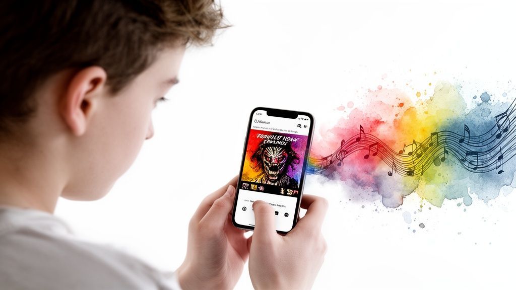
Let's be honest. In an endless sea of new releases, your album art is the first thing a potential fan hears. Long before they press play, that little square image makes a silent promise about the emotions, the story, and the world tucked away in your tracks.
This isn’t just about slapping a cool photo on a square. It’s about creating a first impression so powerful it can stop a thumb dead in its tracks. In the blink-and-you'll-miss-it world of streaming, your cover art has about a millisecond to convince someone you're worth their time.
Think of your artwork as the silent ambassador for your music. It’s your handshake, your calling card, and your sales pitch all rolled into one, tirelessly working for you on Spotify playlists, in Apple Music libraries, and across every social media share. It has to be instantly recognizable and just a little bit mysterious.
And this isn't just fluffy marketing talk—it directly impacts your success. With over 60,000 new songs flooding Spotify every single day, your cover has less than 0.2 seconds to make a connection. The data doesn't lie: albums with professional, eye-catching artwork see 73% more playlist placements. For an indie artist, that translates directly into more streams, more fans, and more growth.
Your album art isn't just packaging; it's the visual hook. In many cases, it’s the one thing that decides whether you get a stream or a skip.
Great artwork nails a few critical jobs all at once:
It’s a Scroll-Stopper: In a feed full of noise, it has to be the one thing that makes someone pause.It Sets the Vibe: The design instantly clues listeners into your genre. Are we talking heavy metal, dreamy folk, or slick pop?It Builds Your Identity: Consistent, killer visuals are the bedrock of a strong artist brand, which is crucial for any effective social media strategy for musicians.
Plus, with all the new AI tools popping up, creating stunning visuals without a Hollywood budget has never been more achievable. We're going to get practical here and show you how to design artwork that doesn't just look good but forges a real connection with the people you want to reach.
Here's a secret every seasoned designer knows: great album artwork almost never starts by firing up Photoshop. It kicks off with a feeling, a core idea that’s so baked into the music it becomes a visual echo of the sound. This is where the real fun is—turning your sonic world into something people can see and feel.
So, before you even think about fonts or color palettes, you have to lock in your album's central theme. If you had to boil the whole record down to one sentence, what would it be? Is it a heartbroken diary? A chaotic party anthem? Maybe it’s a quiet reflection on a long summer evening. Nailing this down is the bedrock for everything else.
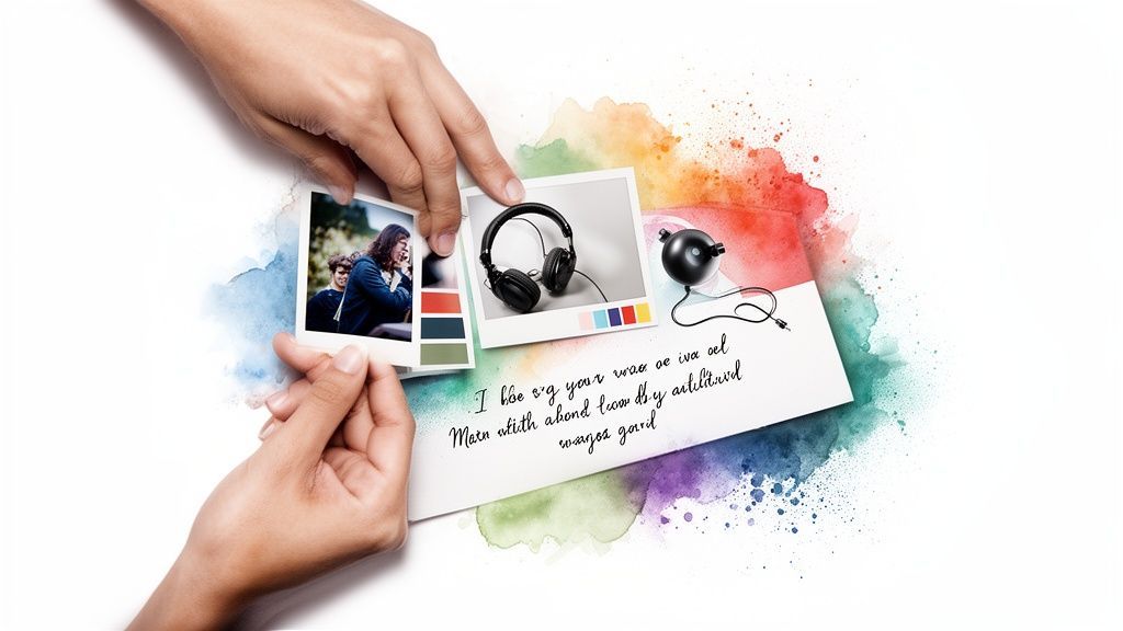
Okay, time to get your hands dirty. Think of this stage like a chef gathering ingredients before cooking. Your mission is to build a mood board, which is just a fancy term for a visual collection of ideas that captures the atmosphere you're chasing.
You aren't looking for the final cover image just yet. Instead, you're on a scavenger hunt for textures, colors, and general vibes that just feel right. This mood board becomes your creative North Star, the thing you can always come back to when you feel lost in a sea of design choices.
To get the ball rolling, ask yourself a few simple questions:
What’s the Mood? If your album was a physical place, where would it be? A neon-drenched city street at 3 AM? A foggy forest at dawn? Who Is Listening? Get specific. Picture your ideal fan. What other artists are on their playlists? What’s their Instagram feed look like? What visuals grab their attention? What’s the Story? Mine your own lyrics for gold. A line about a "porcelain heart" or a "static skyline" can be an incredible starting point for an entire visual concept.
Your mood board is so much more than a collage of cool pictures. It's the visual translation of your sound—the bridge between what your music says and what your artwork shows.
Let's make this real. Imagine you're dropping a raw, indie folk EP. Your mood board would probably be full of faded polaroids, pressed flowers, and lots of earthy tones. On the flip side, a hyperpop banger needs something completely different: a chaotic mix of glitchy digital textures, oversaturated neon colors, and big, chunky typography. Your sound literally tells you what visual language to speak.
This brainstorming phase is also the perfect time to play around and get a little weird with it. For instance, why not get a head start on visual concepts by exploring how to generate AI images? You can feed an AI some of the most descriptive phrases from your mood board and see what it spits out. It’s a killer way to unlock visual directions you might never have thought of on your own.
All this work boils down to a clear creative brief. It doesn’t need to be formal—just a simple document outlining the album’s message, who it’s for, and the aesthetic you’re after. Think of it as your map for the design journey ahead, ensuring every single element you choose actually serves the music. With this foundation, you're ready to start building a cover that people won't forget.
Alright, you've got a killer concept. Now for the fun part: turning that idea into something people can actually see. This is where we get our hands dirty with the big three of design—typography, color, and imagery—and tie it all together with a killer layout.
Think of these as the ingredients in your visual recipe. Get the balance right, and you'll cook up something that makes people stop scrolling and hit play.
Your font choice is your album’s voice before anyone hears a single note. It’s pure personality. Is your music a sweeping, cinematic epic? A timeless serif font like Garamond could be your hero. Is it a raw, blistering punk track? You'll want a tough, in-your-face sans-serif like Helvetica Neue to deliver the knockout punch.
But don't just type out your name and call it a day. Play with the size, weight, and positioning of your text to tell a story. Whatever’s most important—your name or the album title—should be the first thing people see. Create a clear pecking order.
Need a little inspiration? Here's how different genres often approach it:
Indie/Folk: These artists usually go for handwritten, organic, or vintage typewriter fonts. It’s all about creating a personal, authentic feel. Hip-Hop: The range here is huge, from gritty, graffiti-inspired lettering to super clean, high-fashion typography. It really reflects the subgenre's incredible diversity. Electronic: You'll often see futuristic, geometric, or minimalist fonts that echo the music's clean production and digital soul.
Color is a shortcut to emotion. It’s the fastest way to signal a mood, whether it's the deep blues of a heartbreak ballad or the fiery reds of an absolute banger. As you start picking out images and building a palette, a solid understanding color psychology in design is a massive advantage.
Pro-tip: A limited palette of just two or three killer colors almost always looks more polished and impactful than a chaotic rainbow.
Your imagery is the main event. It could be a powerful photo of you, a custom illustration, or even something totally abstract. A portrait forges an immediate, personal bond with the listener. An abstract piece, on the other hand, can hint at the album's vibe without spelling it all out.
Remember, your artwork has to look amazing as a tiny 600x600 pixel thumbnail on a phone and as a full-size vinyl sleeve. Simplicity is your secret weapon here.
Album art has actually gotten way simpler over the years. One analysis of 46,000 covers found their visual complexity has dropped by about 12%. This isn't artists getting lazy; it's a smart move. In the streaming era, bold and uncluttered is what grabs attention on a crowded screen.
Finally, layout is the art of arranging all your pieces into a single, cohesive masterpiece. It’s about creating balance and directing the viewer’s eye exactly where you want it to go. A centered design feels classic and solid, while an asymmetrical layout can inject a ton of energy and movement.
Don't forget the classic rule of thirds. Imagine your canvas is split into a 3x3 grid. Placing your key elements along those lines or at their intersections is a time-tested trick for creating a more dynamic and interesting composition.
And please, give your design some room to breathe! That empty space, or "negative space," is crucial for avoiding a cluttered, amateur look.
To give you a clearer picture, here's a quick cheat sheet on how these elements often come together for different genres.
| Genre | Common Typography | Typical Color Palette | Imagery Style |
|---|---|---|---|
| Rock/Metal | Bold, distressed, or gothic fonts. Sharp and angular. | Dark, high-contrast palettes (black, red, white). Muted tones. | Band photos, symbolic illustrations, abstract textures. |
| Pop | Clean, modern sans-serifs. Sometimes bold and playful. | Bright, vibrant, and saturated colors. Pastels and neons. | High-fashion artist portraits, glossy and polished visuals. |
| Hip-Hop | Varies widely from old-school graffiti to minimalist luxury fonts. | Can be anything from gritty monochrome to bold primary colors. | Candid photography, stylized portraits, conceptual illustrations. |
| Indie/Folk | Handwritten, serif, or typewriter fonts for an authentic feel. | Earthy, muted, and natural tones. Often warm and desaturated. | Candid photos, nature scenes, vintage or lo-fi imagery. |
| Electronic/EDM | Geometric, futuristic, and minimalist sans-serifs. Glitch effects. | Neon, psychedelic, or stark monochrome palettes. Gradients. | Abstract shapes, 3D renders, digital landscapes, sci-fi themes. |
This table is just a starting point, of course. The most iconic album covers are often the ones that break the rules entirely. But knowing the conventions is the first step to knowing how to twist them into something uniquely you.
Alright, you've got your concept locked in and a mood board that's practically bursting with ideas. Fantastic. Now for the fun part: making the thing. Let's roll up our sleeves and walk through how you can use AI as your creative co-pilot, taking you from a blank screen to a pro-level album cover that’s ready for the spotlight.
The first move is to generate a powerful base image. Forget spending hours doom-scrolling through stock photo sites hoping for a miracle. We're going to create something that is 100% unique to you, and it all starts with writing a killer text prompt.
Think of your prompt as a detailed creative brief for a tireless robot artist. The more descriptive and evocative you are, the better your results will be. Seriously, vagueness is your enemy here.
Don't just say, "sad person in a forest." That's a one-way ticket to generic-ville.
Instead, paint a picture with your words. Try something like: "An oil painting of a lone figure, back to the camera, standing in a misty, blue-toned forest at twilight. Volumetric lighting, melancholic and atmospheric, in the style of Caspar David Friedrich." See the difference?
Break it down and get specific with these core elements:
Subject: What's the main focus? Think "a chrome skull" or "two hands intertwined." Setting: Where is this all happening? Maybe "on a neon-drenched city street" or "floating in a cosmic void." Style: What's the vibe? "Photorealistic," "vintage comic book art," or maybe a "3D render." Mood: How should it feel? "Serene," "chaotic," "nostalgic"—you name it.
Using a purpose-built tool like the SendFame AI album cover generator can really kickstart this process. It's designed specifically for this task, so you can spit out a dozen solid variations in just a few minutes. This gives you a fantastic pool of options to cherry-pick from. And as you dive in, it’s worth understanding the nuances of AI art versus traditional human-made art to get a feel for the creative space you're playing in.
Once you've got an AI-generated image that makes you say, "Heck yes," it's time to make it truly yours. Pop that image into your design program of choice. Canva is a brilliant and user-friendly option, while Photoshop or Affinity Photo give you a whole lot more granular control if you're comfortable with them.
This is where you'll bring in your artist name and album title. Remember our chat about typography? Now’s the time to put those principles into action. Play around with different fonts, sizes, and placements until the text feels like it belongs to the artwork, not like it was just slapped on top as an afterthought.
This whole workflow really boils down to three core design pillars: effective typography, compelling imagery, and a cohesive color palette.
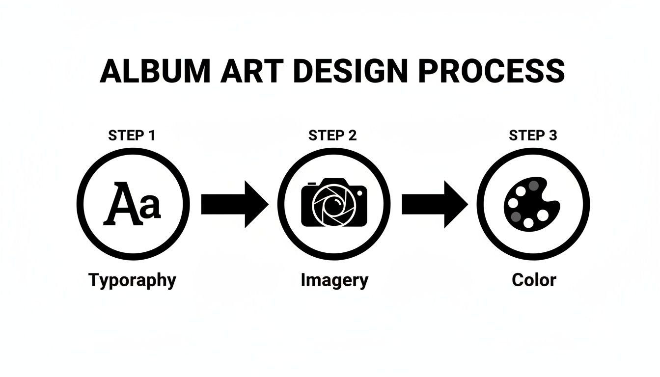
This simple flow is your roadmap—each element builds on the last to create a final piece that feels unified and totally professional.
And don't be afraid to mess with the AI image itself! Tweak the color grading to better match your mood board, add a subtle grain filter for a cool vintage vibe, or layer on other effects to push the artwork into a truly custom territory.
Pro Tip: Constantly zoom out. I mean way out. Check your design at thumbnail size. If your artist name turns into an unreadable smudge, you've got a problem. This is absolutely critical for standing out on Spotify, Apple Music, and anywhere else people are scrolling.
The goal isn't just to use an AI image; it's to use it as a powerful springboard. By layering your own creative decisions on top, you transform a cool computer generation into a piece of art that genuinely represents your music. Whip up a few different versions for your social media promo, and you're officially ready for launch.
Alright, let's get this thing ready for prime time.
You’ve done it. The concept is nailed down, the design is electric, and that artwork looks absolutely killer on your monitor. But hold on—don't pop the champagne just yet. Before you smash that export button, we need to run through the technical pre-flight check.
This is the unglamorous but mission-critical step that separates the pros from the rookies. It’s what ensures your masterpiece looks just as stunning on a Spotify playlist as it will on a record store shelf.
Skipping this part can lead to total disaster. We're talking blurry uploads, rejected files from your distributor, or colors that look depressingly washed out online. It’s a bit tedious, I know, but it’s a non-negotiable part of the album art game.
For streaming platforms, the rules are surprisingly simple, but they are incredibly strict. Your one job is to deliver a file that’s sharp, vibrant, and perfectly optimized for every screen imaginable—from a giant smart TV down to a tiny smartwatch face.
First things first: resolution is king. Your artwork has to be a perfect square, and the industry gold standard is a beefy 3000 x 3000 pixels. Sure, some platforms accept less, but aiming for this size future-proofs your art and guarantees it'll never look like a pixelated mess.
Next up is color. This is a big one. For anything destined for a screen, you absolutely must export using the RGB color profile. If you export in CMYK (which is for printing), your vibrant colors will look dull and muddy online. Trust me.
Finally, the file format is almost always JPEG. It hits that sweet spot between high quality and a manageable file size that distributors love.
Think of your final exported file as your artwork's passport. If the specs are wrong, it won't even get past the gatekeepers at Spotify or Apple Music, let alone connect with your listeners.
Every platform has its own little quirks, but they all share common ground. Getting these core specs right will ensure your artwork sails through the approval process everywhere.
Here’s a handy little cheat sheet for the major players:
| Platform | Minimum Resolution (Pixels) | Recommended Aspect Ratio | Accepted File Formats |
|---|---|---|---|
| Spotify | 3000 x 3000 | 1:1 (Perfect Square) | JPEG, PNG, TIFF |
| Apple Music | 3000 x 3000 | 1:1 (Perfect Square) | JPEG, PNG |
| Amazon Music | 3000 x 3000 | 1:1 (Perfect Square) | JPEG, PNG, GIF |
| TIDAL | 1080 x 1080 | 1:1 (Perfect Square) | JPEG |
| YouTube Music | 800 x 800 | 1:1 (Perfect Square) | JPEG, PNG |
As you can see, sticking to that 3000 x 3000 pixel JPEG in the RGB color space is your safest bet across the board. It covers all your bases and ensures maximum quality.
So, you're pressing this thing on vinyl or CD? Awesome. Welcome to a completely different universe of technical rules.
Physical printing doesn't use RGB. Instead, it relies on a process called CMYK (Cyan, Magenta, Yellow, Key/Black). This means you have to convert your file from RGB to CMYK before sending it to the printer. Be ready for a slight color shift here—those super-bright, glowing screen colors often get a little more muted in print. It's just the nature of ink on paper.
You also need to know about "bleed." This is just a tiny extra margin of your design that extends past the final trim line of the cover or booklet. It’s a safety net that ensures when the big cutting machine comes down, you don't end up with ugly, unprinted white slivers on the edge.
Your printer will give you their exact bleed requirements, so always ask for their template or spec sheet before you start. And if juggling all these different versions feels overwhelming, it might be time to look into some specialized album cover design software to help keep everything organized.
Alright, let's tackle some of those lingering questions you probably have. Getting your album art right can feel like navigating a minefield, but don't worry. I've heard it all, and I've got some straight answers for you.
Ah, the million-dollar question. The budget for album art can be all over the map, from literally zero dollars to a figure that looks more like a down payment on a car. It really just depends on what you've got to spend and how wild your concept is.
The cheapest way in? Go full DIY. You can use tools like Canva or even an AI image generator to cook up something for $0. This path gives you total creative freedom without denting your wallet.
Most artists land somewhere in the middle and hire a freelance designer. This is where you'll see a huge range, but expect to pay anywhere from $100 to $800. The price tag will shift based on the designer's experience and just how much work you're asking them to do. If you're dreaming up a massive, multi-platform campaign, you could be looking at a top-tier design agency, and that's when costs can easily creep into the thousands.
Nope. Absolutely not. Seriously, don't do it. That's a surefire way to get tangled in a legal mess. Ripping an image from Google or Pinterest without the right license is copyright infringement, plain and simple. It’s the kind of mistake that can get your music yanked from streaming platforms before it even has a chance.
There's no gray area here. You must have the explicit legal right to use any visual for commercial purposes.
To keep yourself out of trouble, you've got three solid options:
Use royalty-free stock photos. Find a reputable site and buy the correct license. Make the art yourself. This includes images you generate with AI, but you have to check the terms of service to make sure they grant you commercial rights. Hire a pro. Commission a photographer or an illustrator to create something unique, and make sure your contract gives you the rights to use it.
I see the same avoidable mistakes over and over again. The number one offender is, without a doubt, using a low-resolution image. It looks fine on your computer, but then it turns into a blurry, pixelated mess on Spotify. It just screams amateur.
Another classic blunder is picking a font that’s impossible to read when it's small. You have to remember, most people will see your art as a tiny thumbnail on their phone. If they can't read your name or the album title, you've got a problem. Legibility is everything.
Finally, a massive no-no is designing a cover that has nothing to do with the music. If your artwork looks like a death metal album but your songs are chill acoustic folk, you’re just going to confuse people. The visuals have to match the vibe.
Yes! One hundred percent. This is just smart branding. When you use a consistent visual style for all the singles leading up to your album, you create a campaign that looks cohesive and professional. It's like leaving a trail of breadcrumbs for your audience, helping them instantly connect the tracks to the bigger project you're building up to.
They don't have to be identical copies. The goal is to create a common thread. For example, you could keep the typography and layout the same but swap out the main photo for each single. This builds anticipation and really cements your artistic identity in the minds of your listeners.
Ready to create stunning, unique artwork without the hassle? SendFame’s AI tools make it easy to generate professional-quality album covers in seconds. Start designing today!
Create Epic
SendFame
Create Epic with SendFame!
Questions: info@sendfame.com